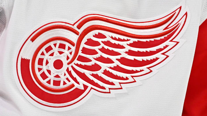
The Detroit Red Wings haven't worn the winged wheel for their entire existence. During their early days as the Detroit Cougars and later, the Detroit Falcons, they had a similar color scheme, but rolled with either that gothic-looking 'D' that resembles what you see on the MLB's Tigers, or a wordmark.
Come 1932-33 when they changed their name to the Red Wings, the famed 'winged wheel' came with it. But it didn't always look like it does today, since the original had a larger wheel and shorter wings. We didn't see the current wheel arrive until the 1948-49 season and little, if anything, really, has changed since.
So, why the winged wheel? Not that I'm not complaining, since it's easily a top-10 if not a top-5 logo in hockey and one of the most iconic in all of the four major North American pro sports leagues. But every iconic logo has a meaning behind it.
Why did the Detroit Red Wings adopt the winged wheel?
You can credit James E. Norris Sr., who bought the team in 1932. He's the one who named them the Red Wings and he designed a logo as a nod to the Montreal Amateur Athletic Association's Winged Wheelers - cool name, right?
Anyway, he thought the logo looked good so he must've figured, "I may as well use it for my hockey team." Norris had some good foresight, because even if you cross someone on the street who knows little about hockey, the NHL, or even the Red Wings, chances are, they're familiar with the winged wheel. That's rare in sports, considering how many teams feel like they need to rebrand these days.
But that wasn't the only reason Norris chose the winged wheel. It was also a good fit for the automotive industry we all know Detroit for, and it's obvious. I mean, Detroit is and always will be the Motor City, after all.
It's funny because, back when I first learned about the Red Wings in the mid-1990s when they started taking over the NHL, my first instinct was that the logo had something to do with the automobile. And I'm sure I'm not the only one who thought the same, especially back before everyone had high-speed internet and you actually had to work to find information.
A team logo that actually has meaning
The Red Wings can consider themselves lucky, because far too often, we see logos and names that have no meaning whatsoever. As for the Wings, it's got not one, but two inspirations, and it never came down to a fan vote because they thought it looked good.
Secondly, it also doesn't have any "storytelling" that few people (and fans) would at least pretend to understand. With so many teams across the major pro sports leagues going in that direction even if the NHL seems to be going back to its classic roots with recent uniform redesigns and the fact they don't need a new look every other time teams take the ice, it makes an old-school logo even more iconic.
Heck, it doesn't even need to do much in the way of modern upgrades. And for that, I'm grateful.
More from Octopus Thrower
