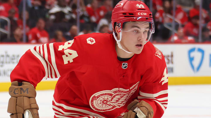
Everyone knew the Detroit Red Wings' new alternate look would be a winner. Now, it's confirmed with The Athletic ranking it No. 1 of the 10 alternate jerseys introduced over the summer.
And really, there shouldn't have been a debate, as Sean Gentille, Shayna Goldman, and Julian McKenzie ranked the uniform an 8, 10, and 10, respectively. And when you look at the jersey, it's easy to see why, from its classic, cream-colored striping pattern to the old-school Winged Wheel and the unique shoulder patch.
McKenzie summed it up best, saying, "How do you design a jersey that uses one of the most iconic shirts in pro sports as an inspiration, on the eve of a centennial birthday no less? The Red Wings could serve as a blueprint for other teams and leagues to follow. The majestic red, the vintage font for the numbers and the white striping at the bottom of the jersey. This is a perfect 10 for me."
The Athletic got it right with the Detroit Red Wings
It's hard to pinpoint a bad uniform from the Red Wings, but these Centennial Threads might be the best. It combines so many eras of one of America's most successful pro sports franchises, and opens the doors to a new era of hockey with what is currently a young Red Wings team.
There was no debate over which jersey should have taken the No. 1 spot. But there was a debate regarding who should have clocked in at No. 2. And here's a hint: It shouldn't have been the Seattle Kraken's "glow in the dark" look.
They needed to rank that one toward the bottom, alongside the Pittsburgh Penguins' Nashville Predators-like gold alternates and the Ottawa Senators red jerseys. Meanwhile, the New York Rangers and Edmonton Oilers got the shorter end of the stick. Both jerseys were nearly flawelss, yet they ranked No. 7 and No. 8, respectively.
The rest of the lineup
The Minnesota Wild took fourth place, and they, like the Wings, got a well-deserved Top 4 finish. Meanwhile, the Washington Capitals' updated "Screaming Eagles" also should have ranked lower, most likely in seventh.
That left the San Jose Sharks and Los Angeles Kings to battle it out for fifth and sixth, which is where they finished. Both unveiled a throwback look, with the Sharks going with an actual throwback while the Kings rolled with their current colors as opposed to turning the clock back to the purple and yellow days.
Still, we don't need to worry too much about where everyone else finished. The Wings took first, and that's all that matters.
