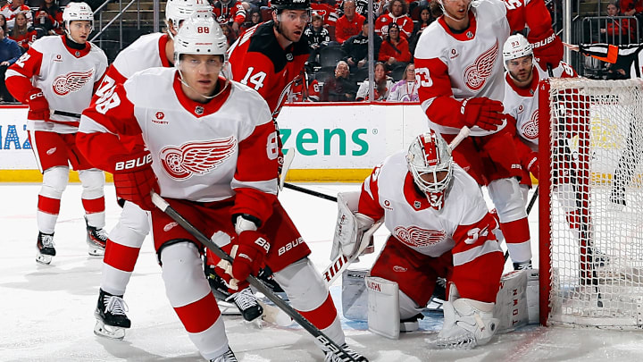
The Detroit Red Wings centennial season uniform has a lot of storytelling in it. But, unlike those literal 'duds' Nike dishes out in the NFL, MLB, and NBA with storytelling that nobody except Nike itself understands while everyone nods and pretends to play along, that's not the case for the Red Wings look.
Check it out below in the X card, and you'll see aspects of the look that captures 100 years of Red Wings history. And yeah, that means adding elements of the Detroit Cougars and Detroit Falcons, names that preceded the Red Wings, in case you didn't know that fun fact.
IT’S HERE AND IT’S BEAUTIFUL! pic.twitter.com/EBjhZ0vpWG
— Detroit Red Wings (@DetroitRedWings) September 15, 2025
Not a bad look, no? That old Gothic-style, "olde English" 'D' associated with the Cougars is on the shorts leg of this one, and I'll be real, I'd love to see that logo used more regularly. I mean, yeah, I know the Winged Wheel's iconic and all and it needs to stick around forever, but that 'D' is clean, classic, and just as timeless.
As for all those stripes? That's a tribute to the Detroit Falcons. And I don't know about you, but hockey and stripes go hand-in-hand. Well, that's the case for all sports (giving you the side-eye, Detroit Lions), but the more, the merrier on a uniform that's supposed to look like it harkens to the past.
Detroit Red Wings nail it with 'storytelling' in uniform reveal
And if you notice the Winged Wheel in the look, it's an inverse of the classic wheel that they wore between 1932 and 1948, complete with old school stitching. Of course, they got the old-school leather-style gloves going on, because that's a prerequisite for any uniform that's paying tribute to 100 years worth of hockey. You can also find that same style on the jersey patches,
One of the cooler aspects is that you'll also see an old-school version of the team's sponsor, Meijer, on the helmet. I know we all have mixed feelings about sponsor logos and decals on jerseys, but for me, this drives home that about everyone's on board to make this uniform look as classic as possible.
This won't be the primary uniform for the Wings this season, but you'll see it as an alternate that I wouldn't mind if it stuck around some. Look for the Wings to don it about 12 times this year, if not more, or for over a quarter of the home games.
Overall, the Red Wings put on a masterclass of how to make a uniform design look good, and one that doesn't need to go into abstract 'storytelling' mode. That's an ode to everyone involved in the uniform design process, and it's a look fans will actually say belongs on the ice.
For me, personally, it's a refresher. After sifting through those City Connects in the MLB, that new Rivalries program in the NFL, and City Editions in the NBA, the NHL once again scores a game-winning goal in how you're supposed to create an alternate uniform.
