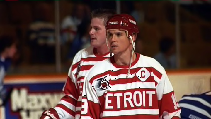
The NHL released its full lineup of Reverse Retro jerseys this past Thursday, and what a glorious day it was as a fan of hockey.
Overall, there were several intriguing releases around the league. From classics reimagined to unused prototypes to brand-new designs, the league had a bit of everything. I will touch on each one briefly and give a fuller opinion on our Detroit Red Wings’ release.
Some designs were not very inspired. Toronto decided to release a jersey that looks nearly identical to their current home jerseys. Chicago’s seems strikingly similar to many of their past jerseys and has been criticized for being an inferior version of the Detroit release. Philadelphia continues to play it safe with jerseys that, while looking decent, are also strikingly similar to the jerseys they have used in the past.
They also have a pair of full-length pants that will be worn for warm-ups on their Reverse Retro nights as a throwback to the Cooperalls they wore for two seasons. So, uh, points for not deciding to wear them during the actual games, I guess? With minor details added, Carolina turned their current Road jerseys red and called it a day. Minnesota released a nice-looking jersey, but they lack creativity as they took their last Reverse Retro jersey, their branding, and made it North Stars colors, this time just making it green. Why mess with something that isn’t broken, I guess?
Next, there were some teams that took some risks involving color palettes and branding kits. The Dallas Stars incorporated their current victory green color into their inaugural season jerseys. Also, the stitching on the star giving it a 3D look, is a nice touch. Winnipeg took most of its current color palette and applied it to its 1990 inaugural jersey.
I liked their decision to remove the red and focus on the royal blue, and the throwback shoulder patch supporting charity was also a good move. Ottawa combining their bold striping patterns from their fantastic 2006 team with their current colors was a slick choice. Plus, the creepy-eyed centurion head logo thrown onto a shoulder is something that I appreciate.
Anaheim took its far superior original logo and striping pattern and applied its current colors to it. While I do like their original colors better, their current colors are unique and make for a solid jersey for this Reverse Retro edition.
